Back
Beacon
Beacon APP Login
Incremental case of a login for an aviation maintenance app.

About the project
Beacon is an Embraer company, a maintenance coordination platform built to unlock teams' productivity and leverage data in the aviation services industry. Beacon connects airlines, maintenance providers, technicians and other aviation related services.
The insertion of users in the platform depended on a previous closed contract with Beacon and the lead time of the sales team to close a contract was over 6 months. The marketing team asked for help and I saw an opportunity to improve user acquisition and the onboarding experience.
Discovery + Framing
The product team was reactive to company issues regarding user acquisition once they were focused in one major client engagement and had limited resources to support marketing and sales teams. This led to a product team dedicated to experiment engagement with users who already signed a contract, disregarding potential new clients.
By analysing users feedback, I understood new potential users and clients got lost when downloading the app, because they would find a login screen with no information about the value proposition and how to create an account.
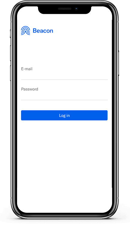
When the app was downloaded, users would find a login screen with no possibility of account creation and no information on how to access the application.
Key Takeaways of Discovery
Marketing and sales team needed help to improve the overall user experience for users that downloaded the app for the first time.
Users got lost when downloading the app and the client company had to create an enterprise account before using any Beacon solution. There was no information about that in any Beacon channel, including website.
Framing
Since beacon was a platform that would connect operators to service providers, I started to frame the problem by trying to understand who would give feedback about the account creation and possibility to use the product.

Next step consisted in requesting data from the marketing team to understand if we could identify the user profiles that would give us feedback about the account creation and the ones that would not. The team was unable to determine the feedback origin from the app store, but could identify feedbacks collected in direct channels, such as sales meetings, website chat and e-mail.
I executed a collaborative session with the marketing, product and sales team to frame user specifications and their respective influence on new accounts. It was understood that operators have more influence in acquiring new accounts, but it would be key to include service providers once they share a lot of information through online forums and mouth to mouth. The product specified we had no available resources for big solutions once they were tied to one major contract improvements, but could help if the solution was simple and easy to execute.
Key Takeaways of Framing
Sales meetings feedbacks endorsed the need to inform new users about account creation and how to join Beacon.
Service providers share information with each other online, often seek for news and how to improve their work environment.
The solution should be for all users and very simple, since we had very limited resources.
Creation and Prototyping
Once the requirements were set and the product team was committed, I started to ideate some possibilities considering channels and content we already had. I brainstormed some ideas and classified them considering change in experience against effort to produce.

The proposal consisted in boosting the existing channels such as business presentations and website with more information, redefining the app home to embrace account creation information and the possibility of revisiting the marketing approach in the future with design methods to improve it. The results were then presented to the marketing team, who were pleased and agreed to all items.
Prototype
Based on brand visual language, I sketched some drafts with focus in humanizing the app.

UI Design
A high-fidelity version was built, with a total of 3 screens: home, account information and login system. The prototype also included a link to the Beacon FAQ.


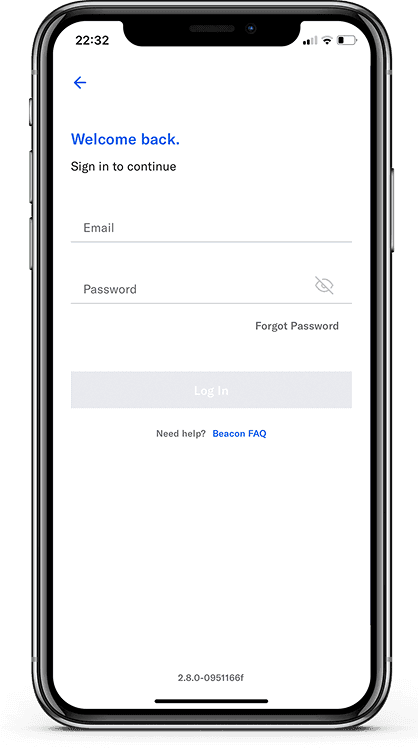
Testing
Since time was a key factor, we executed an internal validation with the product team, similar to a guerrilla test.
The evaluation was composed of 1 phase:
UI design and navigation validation;
No major usability issues were found in the moderated tests;
Results and learnings
The Beacon team loved the new home and the product team approved the changes for the next development sprint.
Business inquiries for new accounts increased 30% in the next month.
The product team started to track data of FAQ usage and user doubts.
Learnings
This project challenged me to come up with an universal solution for users with different needs, while considering limited resources;
It helped me to better work as team player and negotiate resources;
It helped me to better understand aviation contracts and aviation user problems.